

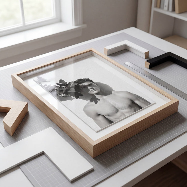
Paper, Frame, Glazing — and a Hand for Materiality
By Peter Sandel · Provenance & Patina Journal
What makes a framed art print feel collected, not mass-produced
Some framed art prints feel like real objects: something to keep, move with, and live alongside. Others feel temporary.
The difference is rarely the image alone.
It is often the material decisions around it: the paper surface, the ink, the frame profile, the glazing, the mat proportion. The parts you register before you name them. The parts your eye reads as considered.
At Provenance & Patina, we approach framed art the way we approach interiors: through proportion, materiality, and the details that determine how something feels over time.
Paper: the surface sets the mood
Most people do not need to know the name of a fine art paper to understand its effect. A good archival paper gives an image depth, softness, and presence. It keeps highlights from feeling brittle and allows tonal transitions to feel more natural.
For pieces where we want nuance, depth, and a surface that does not glare back at the room, we look to museum-grade papers selected for their texture, weight, and tonal performance. The point is not the label. It is the result: a print that reads as an object, not simply an image on a sheet.
Pigment inks: stability you can live with
A framed print should be made for real rooms. Light changes. Seasons shift. Walls get touched. Homes are lived in.
Pigment-based inks are chosen for tonal stability and longevity, helping the work hold its depth and color over time. It is a technical choice, but the effect is simple: the image continues to feel resolved long after the first impression.
Frames: proportion is the difference
A frame can be decorative, or it can be architectural. For most contemporary artwork, we prefer simplicity: a frame that supports the image without competing with it.
The details matter. Crisp miters. Clean corners. The right reveal. The right relationship between image, mat, and frame. These decisions are subtle, but they are often what separate a framed print that feels gallery-level from one that feels generic.
A good frame does not need to announce itself. It should hold the work with scale, clarity, and proportion.
Glazing: protection and experience
Glazing affects both the life of the piece and the way it is seen.
For many larger-scale works, we recommend museum-grade acrylic rather than traditional glass. It is lighter, safer, and better suited to real homes. Paired with UV protection, and in some cases low-reflection glazing, it helps preserve the work while keeping the viewing experience clean in changing light.
The goal is simple: protect the piece without interrupting the image.
A note on the hand
The most persuasive objects usually show evidence of care. Not ornament for its own sake, but precision: measured cuts, balanced margins, clean corners, mats that feel proportioned to the image rather than randomly assigned.
That is the hand we’re after: restraint, accuracy, and a respect for the object being made.
Quality and Craftsmanship
Each custom framed art print is produced on museum-grade archival paper using pigment-based inks for exceptional tonal stability.
What that means in practice is simple: the work reads with depth, the surface feels intentional, and the piece is made for rooms where light moves, seasons change, and art becomes part of daily life.
When you buy framed art online, you are also trusting the choices behind it. Paper, ink, frame, mat, and glazing all shape the final object. We choose those materials carefully because they determine how the work lives on the wall.