

Hellebore Season in Greenwich Village
By Peter Sandel · Provenance & Patina Journal
The kind of beauty you discover on foot becomes the kind you want to live with.
Spring in New York doesn’t arrive with a trumpet. It arrives in fragments: a warmer afternoon, a longer blue hour, a blooming tree you didn’t notice last week. And if you’re walking the Village the way it asks to be walked, a window box exploding with color that stops you mid-block.
This is how Helleborus season shows up for me. When I moved to New York nearly 20 years ago, I overheard someone talking about hellebores and how fond real New Yorkers are of the hardy plant. It was my first introduction to the dark flowering plant, and now I can’t help but look for them every winter, with the eye of a real New Yorker.
This photo was taken in the Village in March 2018 (says my iPhone)—one of those early, unmistakable signs that winter had started to loosen its grip.
The hardy hellebore tends to camouflage into flower beds and tree wells, but once you spot them you can’t stop. Not as a grand garden moment, but as something more: a deep, painterly bloom tucked into a planter on a brownstone stoop or mixed in around shrubbery. Their dark petals against old brick. Deep green leaves against cast iron. The kind of contrast that only looks effortless because it’s been chosen by nature to stay.
Year-round, I document flowering stoops and window boxes the way some people save menus from great restaurants. It’s a record of time and space and, for me, a way to commune with nature.
The hellebore is a reminder that beauty doesn’t need to announce itself to be impactful. And it’s a useful truth for design: what we notice becomes what we want and love to live with.
From bloom to pattern
A flower is never just a flower once you’ve looked at it long enough. It becomes a memory, a ritual. Its shape and color are familiar and feel like home.
The hellebore, especially, has a kind of graphic integrity: the way its petals fold, the way its head dips, the way the plant feels both gritty and delicate. It’s easy to understand why New Yorkers identify with the hardy plant, as it shoulders the dark winter and holds a bloom right into late spring.
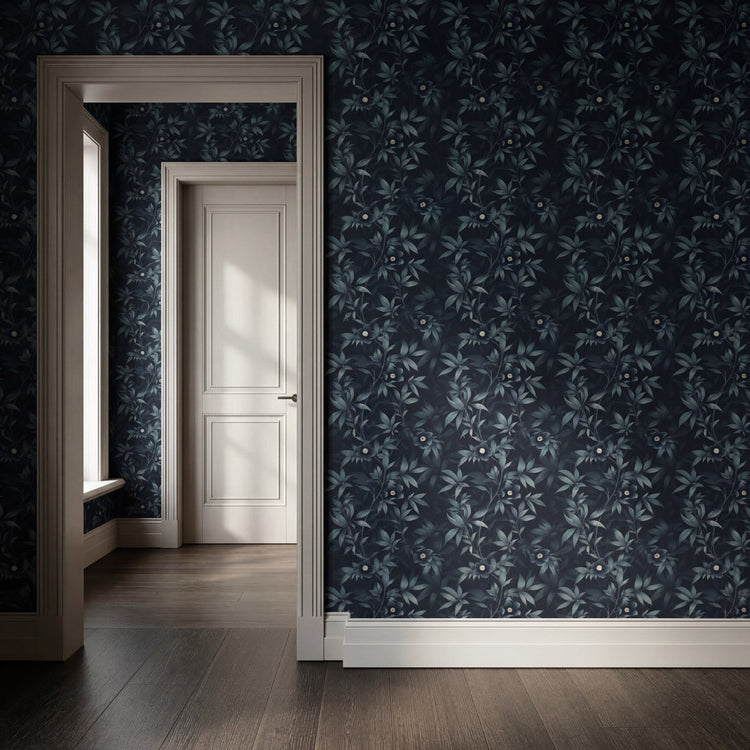
When I decided to create a wallpaper collection around botanicals, the cultivated New York hellebore was the first to come to mind when I scrolled through my phone of thousands of flowering moments.
Wallpaper isn’t just a decorative mural. It’s a memory field—an atmosphere of feeling and mood. The best patterns don’t have to shout if they whisper a story. They hold the room. They give you something to return to over time.
The hellebore motif does that. It has depth without fuss. It reads botanical, but not precious. It behaves like texture as much as image. And just like a New Yorker, it prefers to be dressed in black.
What we’re really designing
At Provenance & Patina, we talk about collecting because that’s the behavior we recognize in ourselves and in our clients. Not shopping as acquisition, but choosing with intention, as an editorial practice.
A window box photo in your camera roll is a small act of collecting. It’s saying: this belongs in my archive of what speaks to me and how it connects to my worldview.
The same is true of wallpaper, framed art prints, and objects with a history. They aren’t only design decisions. They’re evidence of what you pay attention to.
By April, tulips take over the City—and the city shifts again. Spring arrives in waves, and each one leaves a different colorful memory.
A seasonal invitation
If you’re in New York this month, take the long route home. Walk a few extra blocks. Look up. Look down. Notice the window boxes. Notice what stops you.
Because that’s where your best design instincts come from: not from trends, but from attention. And if hellebore season is your kind of beauty—textural, restrained, slightly moody—you already know why “Midnight Blooms” belongs on a wall.
For a quick primer on hellebores, Central Park Conservancy has a helpful overview: https://centralpark.org/hellebores/